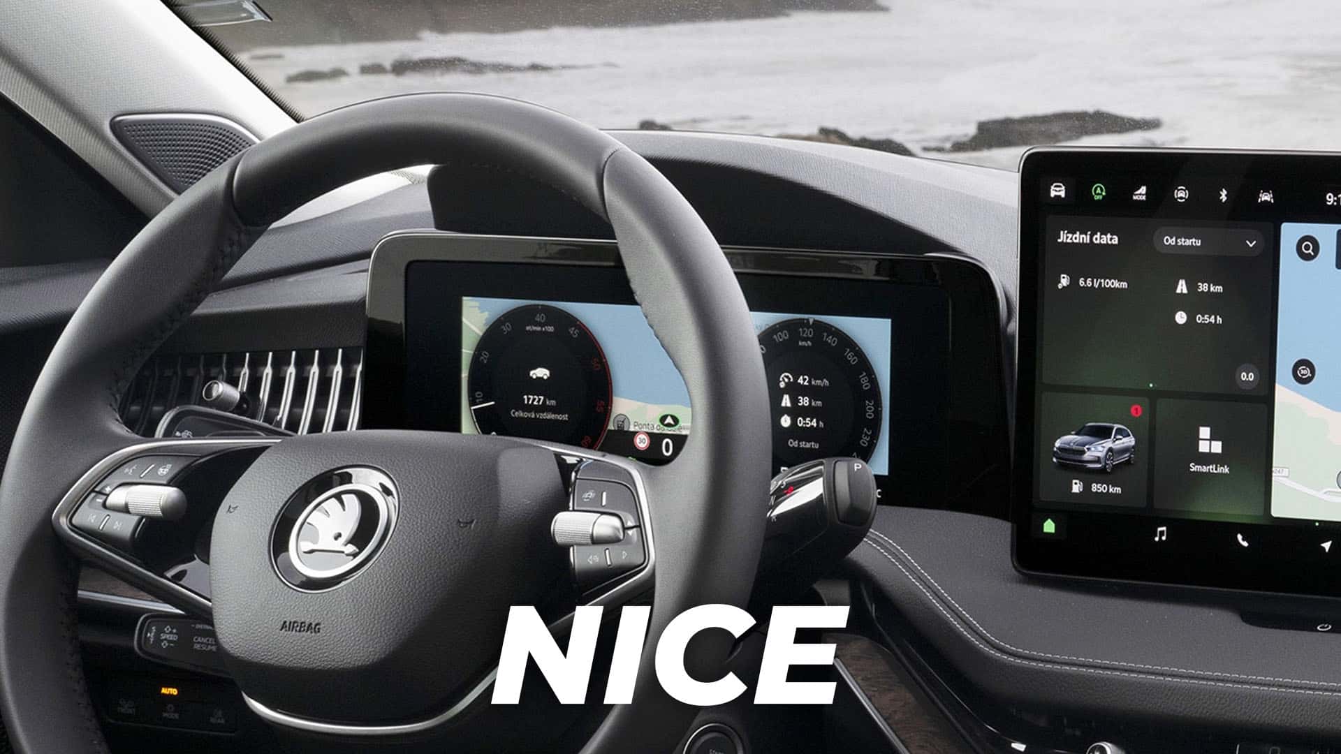
The automaker Skoda may not be familiar to stateside readers, but it’s an important part of the VW group in Europe. Think of it like Pontiac was to Chevy, before GM unceremoniously killed off the brand to avoid bankruptcy in 2009. Skoda makes a version of the Passat called the Superb, but in this instance, there’s at least one part of the car that doesn’t quite measure up to its name.
The Superb’s new digital gauge cluster looks like it was wedged into the dashboard and nailed into place right in front of the old analog unit. The infotainment screen is big and protruding as well, but at least it looks somewhat framed by the dashboard. The cluster is inexcusable, though, and the bezel around the screen is massive. It looks like they asked me to do it.
The unusual part of this is that the interior of the Volkswagen Passat, which is effectively the same car, doesn’t look like this. The screen itself may actually be the same part, but it’s blended into the cluster in a much more aesthetically pleasing way. There aren’t even visible nail heads. Very impressive.

To be fair, I think a lot of automakers don’t really know what to expect when it comes to their customer’s interior design preferences. The smartphoneification of everything means that some people love the fact that there’s a big screen in their car. It’s so pretty, so nice to touch, it feels good. Others do not like it at all, seeing it as a big rectangular distraction that’s more difficult to use than hard buttons.
Whichever side of that fence you land on, I think we can all agree there are better ways to do it than Skoda’s approach. If you’re gonna throw a screen in a car, at least make it look like you didn’t literally throw it in.


